Back to Blog
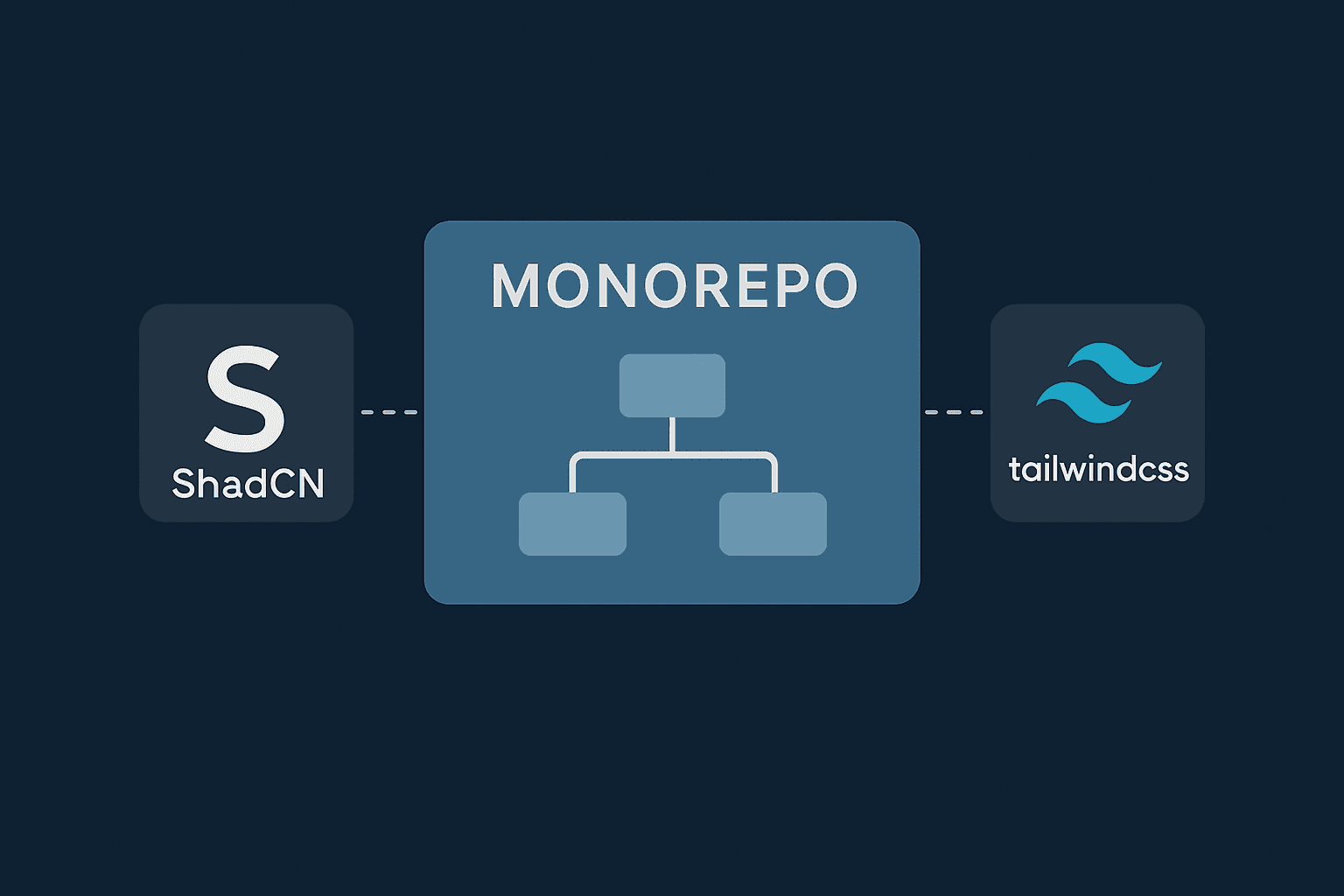
How to Add Shadcn UI and Tailwind CSS in an Existing Monorepo
- #monorepo
- #shadcn-ui
- #tailwind-css
- #typescript
- #turborepo
Cynthia Emerenini
Introduction
Just last week, I was searching everywhere for a way to add Shadcn UI to a monorepo I already had, but I couldn't find anything truly helpful. The official Shadcn UI monorepo documentation mostly showed how to set up a brand new project, which wasn't what I needed at all.
In this article, I will show you how I managed to add Shadcn UI to an existing monorepo without starting from scratch. This guide will help you integrate these powerful tools into your current setup, making your development process smoother and more efficient.
1. Setting Up Your Monorepo with TailwindCSS
To begin, you can create a new monorepo project that includes TailwindCSS. A good starting point is using the Turborepo example with TailwindCSS. You can initiate a new project with the following command:
npx create-turbo@latest -e with-tailwind
This command sets up a monorepo with pre-configured TailwindCSS in its applications and packages, such as `docs` (a Next.js app), `web` (another Next.js app), and `ui` (a React component library). This setup ensures that TailwindCSS is ready for use across your monorepo.
2. Manually Installing Shadcn UI
After setting up your monorepo with TailwindCSS, you can proceed with the manual installation of Shadcn UI. This process involves adding necessary dependencies, configuring path aliases, and setting up global styles and a `components.json` file. The following steps are to be taken in your `packages/ui` directory.
2.1 Add Dependencies
First, add the required packages to your project. These packages provide utilities for styling and component functionality. Please, feel free to use your preferred package manager, I will be using `yarn` package manager for the sake of this article.
yarn add class-variance-authority clsx tailwind-merge lucide-react tw-animate-css
2.2 Configure Path Aliases
Next, update your `tsconfig.json` file to include path aliases. This helps in organizing your imports and makes it easier to reference components and utilities within your project. The `@/*` alias is a common choice, but you can use others if preferred.
{
  "compilerOptions": {
    "baseUrl": ".",
    "paths": {
      "@/*": ["./*"]
    }
  }
}
2.3 Set Up Global Styles
Add the core TailwindCSS and Shadcn UI styles to your `styles/globals.css` file. This includes importing TailwindCSS and defining CSS variables for theming, which allows for easy customization of your UI components.
@import "tailwindcss";
@import "tw-animate-css";

@custom-variant dark (&:is(.dark *));

:root {
  --background: oklch(1 0 0);
  --foreground: oklch(0.145 0 0);
  --card: oklch(1 0 0);
  --card-foreground: oklch(0.145 0 0);
  --popover: oklch(1 0 0);
  --popover-foreground: oklch(0.145 0 0);
  --primary: oklch(0.205 0 0);
  --primary-foreground: oklch(0.985 0 0);
  --secondary: oklch(0.97 0 0);
  --secondary-foreground: oklch(0.205 0 0);
  --muted: oklch(0.97 0 0);
  --muted-foreground: oklch(0.556 0 0);
  --accent: oklch(0.97 0 0);
  --accent-foreground: oklch(0.205 0 0);
  --destructive: oklch(0.577 0.245 27.325);
  --destructive-foreground: oklch(0.577 0.245 27.325);
  --border: oklch(0.922 0 0);
  --input: oklch(0.922 0 0);
  --ring: oklch(0.708 0 0);
  --chart-1: oklch(0.646 0.222 41.116);
  --chart-2: oklch(0.6 0.118 184.704);
  --chart-3: oklch(0.398 0.07 227.392);
  --chart-4: oklch(0.828 0.189 84.429);
  --chart-5: oklch(0.769 0.188 70.08);
  --radius: 0.625rem;
  --sidebar: oklch(0.985 0 0);
  --sidebar-foreground: oklch(0.145 0 0);
  --sidebar-primary: oklch(0.205 0 0);
  --sidebar-primary-foreground: oklch(0.985 0 0);
  --sidebar-accent: oklch(0.97 0 0);
  --sidebar-accent-foreground: oklch(0.205 0 0);
  --sidebar-border: oklch(0.922 0 0);
  --sidebar-ring: oklch(0.708 0 0);
}

.dark {
  --background: oklch(0.145 0 0);
  --foreground: oklch(0.985 0 0);
  --card: oklch(0.145 0 0);
  --card-foreground: oklch(0.985 0 0);
  --popover: oklch(0.145 0 0);
  --popover-foreground: oklch(0.985 0 0);
  --primary: oklch(0.985 0 0);
  --primary-foreground: oklch(0.205 0 0);
  --secondary: oklch(0.269 0 0);
  --secondary-foreground: oklch(0.985 0 0);
  --muted: oklch(0.269 0 0);
  --muted-foreground: oklch(0.708 0 0);
  --accent: oklch(0.269 0 0);
  --accent-foreground: oklch(0.985 0 0);
  --destructive: oklch(0.396 0.141 25.723);
  --destructive-foreground: oklch(0.637 0.237 25.331);
  --border: oklch(0.269 0 0);
  --input: oklch(0.269 0 0);
  --ring: oklch(0.439 0 0);
  --chart-1: oklch(0.488 0.243 264.376);
  --chart-2: oklch(0.696 0.17 162.48);
  --chart-3: oklch(0.769 0.188 70.08);
  --chart-4: oklch(0.627 0.265 303.9);
  --chart-5: oklch(0.645 0.246 16.439);
  --sidebar: oklch(0.205 0 0);
  --sidebar-foreground: oklch(0.985 0 0);
  --sidebar-primary: oklch(0.488 0.243 264.376);
  --sidebar-primary-foreground: oklch(0.985 0 0);
  --sidebar-accent: oklch(0.269 0 0);
  --sidebar-accent-foreground: oklch(0.985 0 0);
  --sidebar-border: oklch(0.269 0 0);
  --sidebar-ring: oklch(0.439 0 0);
}

@theme inline {
  --color-background: var(--background);
  --color-foreground: var(--foreground);
  --color-card: var(--card);
  --color-card-foreground: var(--card-foreground);
  --color-popover: var(--popover);
  --color-popover-foreground: var(--popover-foreground);
  --color-primary: var(--primary);
  --color-primary-foreground: var(--primary-foreground);
  --color-secondary: var(--secondary);
  --color-secondary-foreground: var(--secondary-foreground);
  --color-muted: var(--muted);
  --color-muted-foreground: var(--muted-foreground);
  --color-accent: var(--accent);
  --color-accent-foreground: var(--accent-foreground);
  --color-destructive: var(--destructive);
  --color-destructive-foreground: var(--destructive-foreground);
  --color-border: var(--border);
  --color-input: var(--input);
  --color-ring: var(--ring);
  --color-chart-1: var(--chart-1);
  --color-chart-2: var(--chart-2);
  --color-chart-3: var(--chart-3);
  --color-chart-4: var(--chart-4);
  --color-chart-5: var(--chart-5);
  --radius-sm: calc(var(--radius) - 4px);
  --radius-md: calc(var(--radius) - 2px);
  --radius-lg: var(--radius);
  --radius-xl: calc(var(--radius) + 4px);
  --color-sidebar: var(--sidebar);
  --color-sidebar-foreground: var(--sidebar-foreground);
  --color-sidebar-primary: var(--sidebar-primary);
  --color-sidebar-primary-foreground: var(--sidebar-primary-foreground);
  --color-sidebar-accent: var(--sidebar-accent);
  --color-sidebar-accent-foreground: var(--sidebar-accent-foreground);
  --color-sidebar-border: var(--sidebar-border);
  --color-sidebar-ring: var(--sidebar-ring);
}

@layer base {
  * {
    @apply border-border outline-ring/50;
  }
  body {
    @apply bg-background text-foreground;
  }
}
2.4 Create `components.json`
Create a `components.json` file in the root of your `packages/ui` folder. This file configures Shadcn UI, specifying the style, where components and utilities are located, and other settings.
{
  "$schema": "https://ui.shadcn.com/schema.json",
  "style": "new-york",
  "rsc": false,
  "tsx": true,
  "tailwind": {
    "config": "",
    "css": "src/styles/globals.css",
    "baseColor": "neutral",
    "cssVariables": true,
    "prefix": ""
  },
  "aliases": {
    "components": "@/components",
    "utils": "@/lib/utils",
    "ui": "@/components/ui",
    "lib": "@/lib",
    "hooks": "@/hooks"
  },
  "iconLibrary": "lucide"
}
2.5 Create `lib/utils.ts`
Create a utility file, `lib/utils.ts`, which provides a helper function for combining TailwindCSS classes. This function uses `clsx` for conditional class joining and `tailwind-merge` for resolving conflicting TailwindCSS classes.
import { clsx, type ClassValue } from "clsx"
import { twMerge } from "tailwind-merge"

export function cn(...inputs: ClassValue[]) {
  return twMerge(clsx(inputs))
}
3. Adding New Shadcn UI Components
Once Shadcn UI is set up, you can easily add new components to your project using the Shadcn UI CLI. When working in a monorepo, you should run the `add` command from the shared `packages/ui` directory. This command fetches the component's code and adds it to your project, allowing you to customize it as needed.
For example, to add a `button` component using `yarn`, navigate to your application's directory and run:
cd packages/ui
npx shadcn@latest add button
This command automatically places the `button` component's code in the `packages/ui` directory (e.g., `packages/ui/src/components/button.tsx`) and updates the import paths in your application. You can then import and use this component in your applications from the `@workspace/ui` package, like this:
import { Button } from "@workspace/ui/components/button"
This approach centralizes your UI components in `packages/ui`, making them easily shareable across all applications within your monorepo.
Conclusion
Integrating Shadcn UI and TailwindCSS into a monorepo streamlines UI development by providing a robust styling framework and a collection of customizable components. By following these steps, you can efficiently set up your development environment and start building beautiful, consistent user interfaces across your monorepo projects.
If this was helpful, please like and share! ⚡️